Vuistregels voor een goede landingspagina

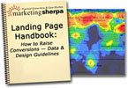 Marketing Sherpa heeft recentelijk de resultaten van een onderzoek naar het gedrag van sitebezoekers gepubliceerd in het rapport The Landing Page Handbook ($247). Inmiddels verschijnen op tal van websites en weblogs reacties en samen-vattingen van het onderzoek (waaronder het eerder genoemde Eyetools).
PeperIT verwijst vandaag naar een artikel van Brian Livingstone waarin een aantal handige vuistregels over de (landings)pagina van een website.
Op basis van eyetracking-onderzoek komt Marketing Sherpa met de volgende vuistregels (om een goede landingspagina op te zetten):
- Most Web pages are scanned, not read
Unlike printed pages, Web pages tend to be viewed by visitors for only a handful of seconds. During those seconds, people glance at a few words in the headline (but not all of the words), look at any images and captions on the page, and then make a snap decision about whether or not the page is worth looking at any further.
- Images trump left-to-right reading
In the English language, there’s a strong tendency to read from left to right and from top to bottom. Marketing Sherpa found that this tendency goes out the window, so to speak, when you put images on a Web page. People experience such a strong pull to look at on-screen images, especially human faces, that pictures overwhelm everything else. A picture placed on the right-hand side of a Web page can keep your readers’ eyes from ever getting back to words you may have on the left side.
- Keep important images on the left
One big lesson of the study, therefore, is this: If your Web page bears a dominant image, such as a product “beauty shot” or a photo of a seminar speaker, put it on the left side of the page. This allows readers, once they’ve examined the photo, to move their eyes either down a bit or to your right-hand column, as they wish. This is a more natural reading style than trying to get people to move their eyes to an image on the right, and then “backwards” to text on the left.
- The upper-left corner is always seen
The study’s eyetracking findings indicate that the upper-left corner of a Web page is almost always viewed by visitors. This is why most Web sites intuitively place their corporate logo there. But Marketing Sherpa found that a large number of visitors also let their eyes drift to a spot just below the logo. This makes the tag line under your logo very valuable real estate to explain the benefits of your site.
- Captions are high-readership
For the same reason as the upper-left rule just mentioned, the space immediately below any image on a Web page is extremely valuable. The eyetracking study found that material underneath images was viewed quite often. Instead of using this space for unrelated phrases, or nothing, make sure to state the benefits of your product there.
- Hyperlinks capture attention, for good or ill
Any text you underline or color in blue (like a hyperlink, whether it’s clickable or not) will get high readership. This effect is so strong that many visitors will read only the emphasized text before deciding, “This site is/isn’t for me.” That’s not a reason to eliminate hyperlinks from your landing pages, but it’s definitely a reason to make them relevant to what you’re selling.
- Lose the navigation on landing pages
Unlike the hyperlinks mentioned above, navigational links or buttons on a landing page usually distract visitors from the main purpose of the page. You should eliminate navigation bars, including “Site Map” or “About Us” buttons, on pages where you want a visitor to take a single action, such as placing a product in a shopping cart or signing up for a free trial. Sites that don’t expect anything from visitors, but are bringing traffic to a single page solely to invite them to click around within a site, might be exceptions to this rule, but probably not.
Bron:
Oprichter/partner Upstream, Marketingfacts, Arnhem Direct, SportNext, TravelNext, RvT VPRO, Bestuur Luxor Live, social business, onderwijs, fotografie en vader!
In je RSS feed staat nu: [[ This is a content summary only. Visit MyWebsite.com for full links, other content, and more! ]]
Dat lijkt me onnodige info, Marco. 😀
Goed rapport. Ik kom verder nog weinig serieuze berichtgeving tegen over de rol van iconografie en associatieve waarneming op websites. Iemand?
Nog steeds interessant bericht (5 jaar later…)
Gerelateerde artikelen
Marketingfacts. Elke dag vers. Mis niks!
Marketingfacts. Elke dag vers. Mis niks!